INDUSTRY:
User Experience
CLIENT:
Denver Bicycles
YEAR:
2024
TYPE:
Desktop Redesign
Denver Bicycles


Evan
Thompson

Occupation
Director of Retail

Location
Denver, CO

Age
24 years old

Family
Married. 2 children

“I’m either helping folks at work or juggling my kids around. I find it hard to spend a lot of time looking for what I need for my upcoming race.”
Problem Statement
Working parents are frustrated when trying to find a caregiver who matches both their criteria and their children's needs. They need an ethical and transparent platform to connect with caregivers who are experienced in childcare, prioritize safety, and are reliable.
Journey Map
View on Figma

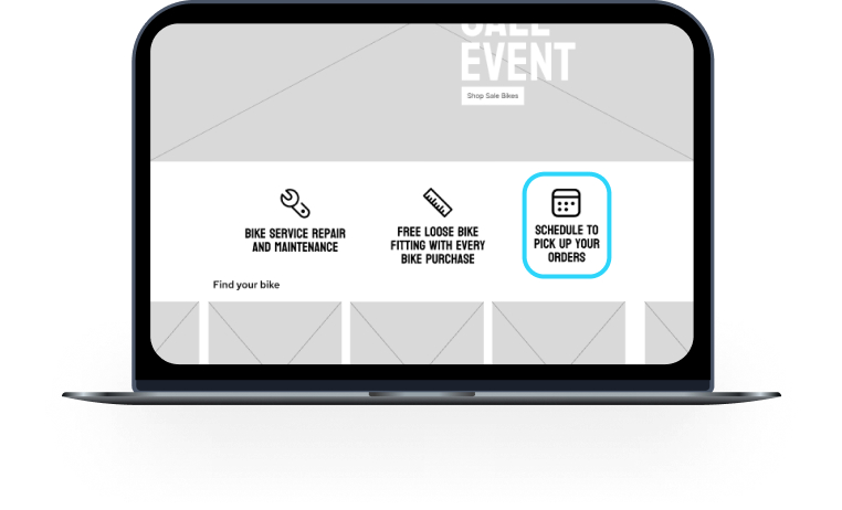
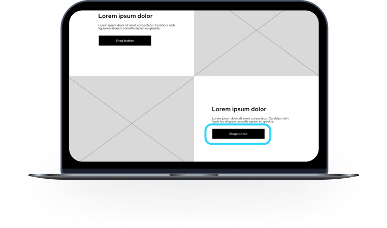
Clearly Showing users what to expect before making a purchase
Creating clean and easy to read layout for seamless user interaction.
High Fidelity Mobile Mockups
Kira
About
Resume
INDUSTRY:
User Experience
CLIENT:
Denver Bicycles
YEAR:
2024
TYPE:
Desktop Redesign
Denver Bicycles

Brief
Redesigning an e-commerce website that embodies clean and sleek aesthetic, professionalism, and a immersive and vibrant shopping experience.
Challenge
Finding skilled childcare is not a quick and easy task. It can be hard for parents to find the right caregiver who hold real experience and are reliable. Trust is vital in this industry.
This is why:
- Parents trusting the company to find and recommend reliable and trustworthy caretakers for their children.
- Offering company transparency.
- Finding care that fits your specific and unique family needs.
- Creating a mobile caretaking application for parents of all orientations.

Demographics
- Ages 25 - 40 years olds
- Casual cyclists
- Frequent cyclists
- Young professionals
- Based in Colorado
- Athletic
User Interviews
I interviewed a total of 4 users who all are involved with biking in their own ways.
2 users are avid cyclists. They are both involved in bike racing and will spend the summer either mountain or gravel riding.The other 2 users enjoy road and mountain biking but more recreationally. They will bike around town and go on mountain rides here and there. But it is not their priority.
Evan
Thompson
Occupation
Director of Retail
Location
Denver, CO
Age
24 years old

Family
Married. 2 children
“I’m either helping folks at work or juggling my kids around. I find it hard to spend a lot of time looking for what I need for my upcoming race.”
Problem Statement
Working parents are frustrated when trying to find a caregiver who matches both their criteria and their children's needs. They need an ethical and transparent platform to connect with caregivers who are experienced in childcare, prioritize safety, and are reliable.
Journey Map
View on Figma
Comparative & Competitive Analysis
A C&C analysis was conducted with 2 direct competitors and 2 indirect. The C&C was to find different approaches other companies were taking to accumulate and retain traffic on their websites. Conducting this analysis would determine features that would be deemed important to implement
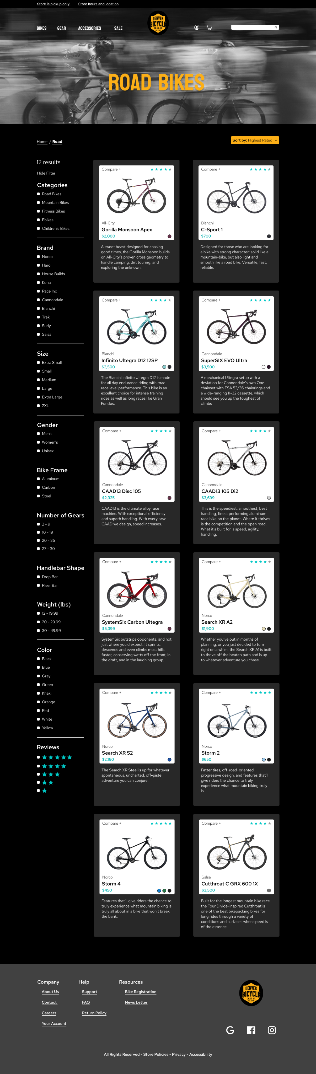
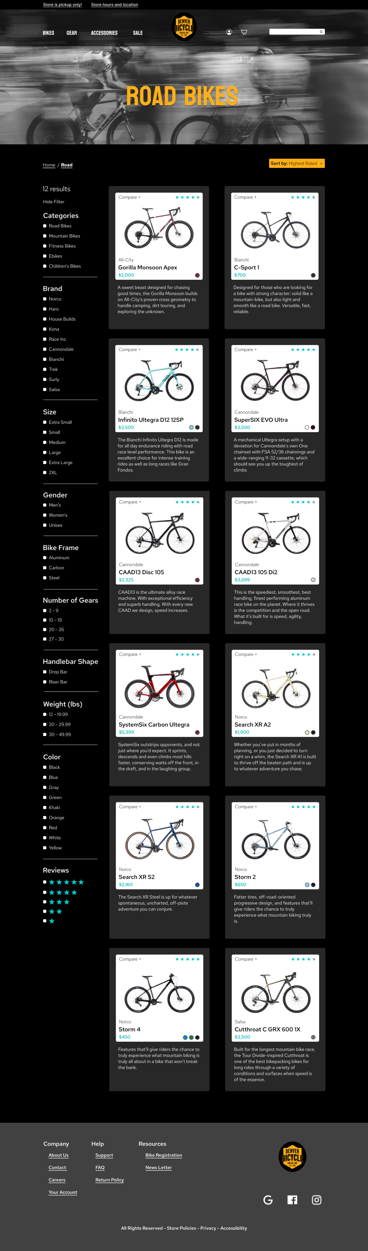
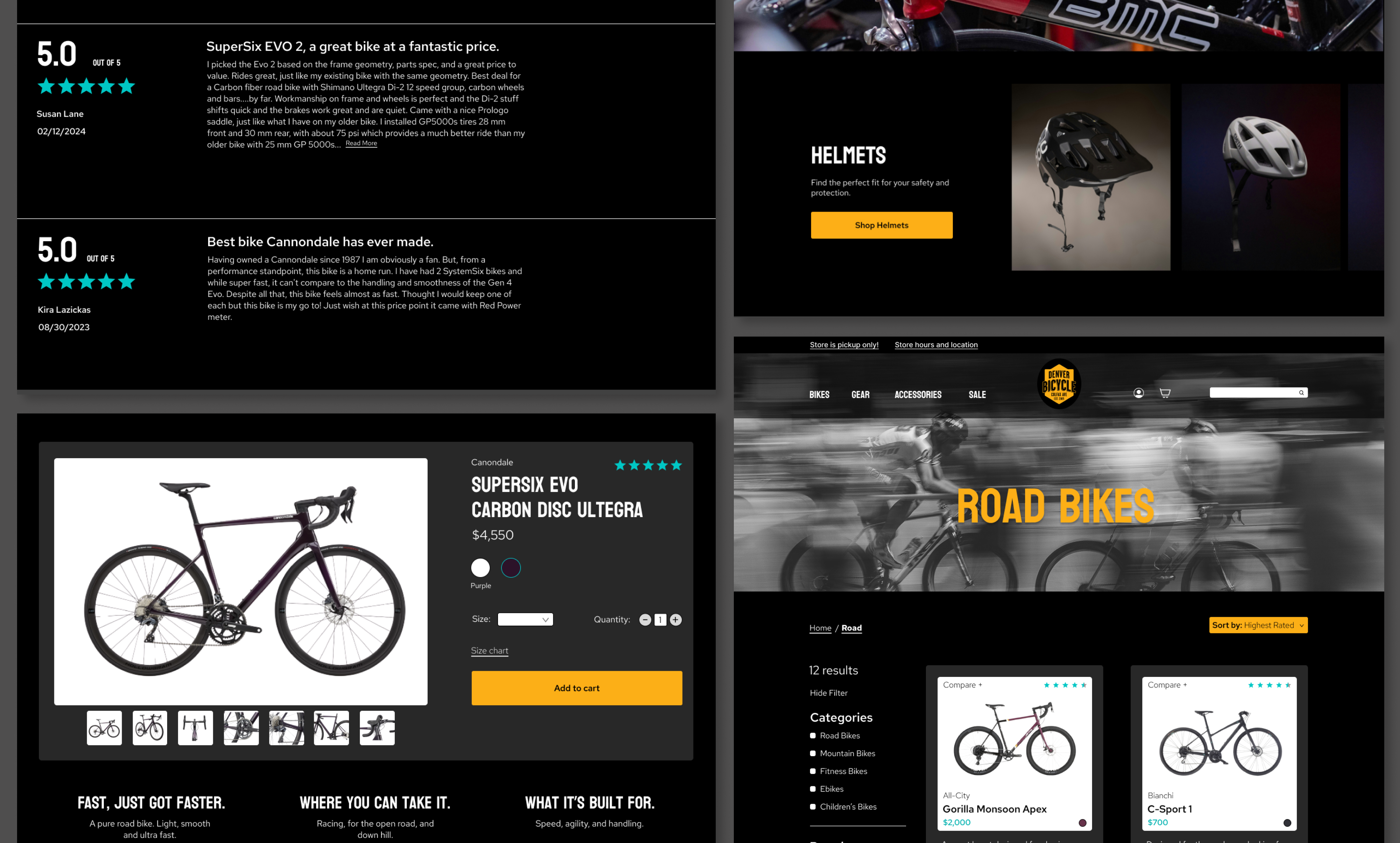
- The C&C revealed that while technical product details were prominently displayed on most sites, an accordion dropdown menu design was decided on to keep the page clean.
- User reviews was a highly valued element across the analysis, so I ensured they remained easily accessible and discoverable through persistent and intuitive placement on the page.
- Consistent with industry practices, I incorporated a subtle search bar and category icons in the header for accessible navigation which kept consistent throughout the webpage.
- Base Camp
- Slowhi
- Campus Cycles
Competitive
- REI
- Smith Optics
- Target
Comparative
Brainstorming
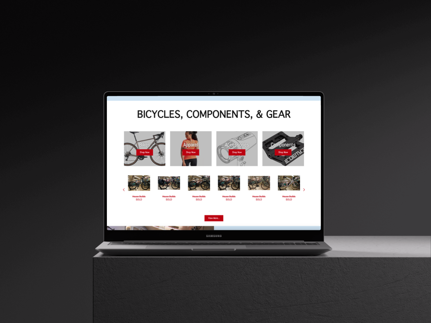
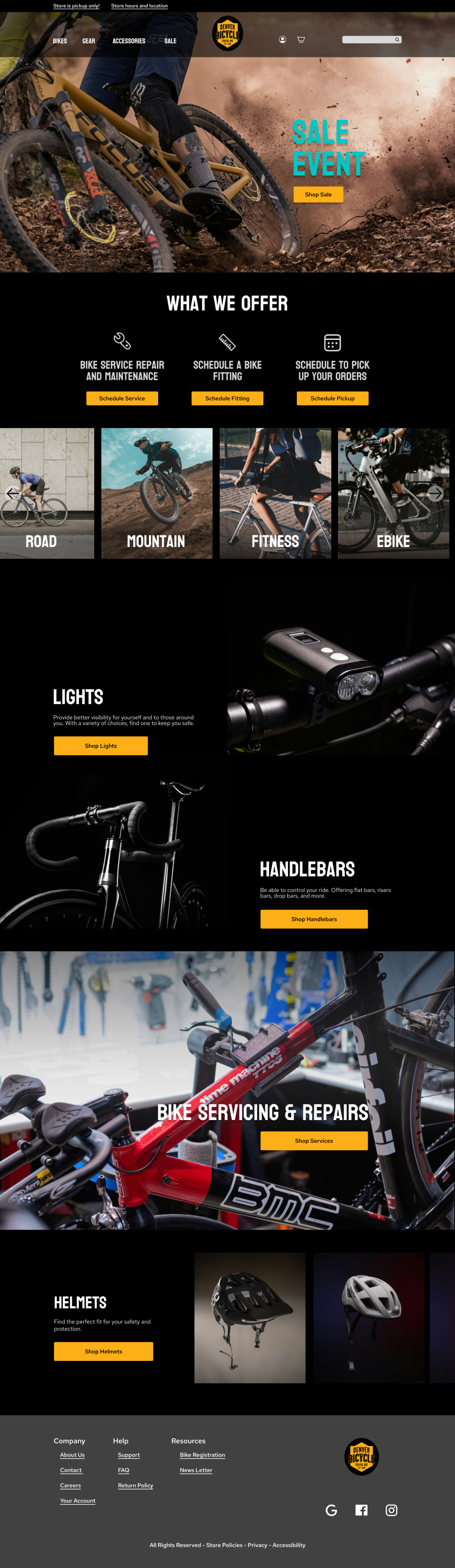
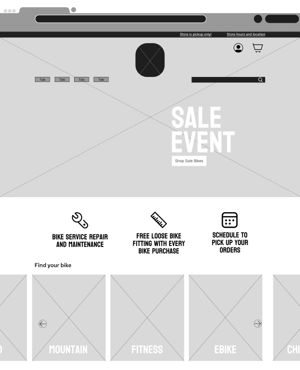
The original website lacked e-commerce functionality, serving merely as an informational hub for services and products—many of which were displayed as "sold out." A key objective of the redesign was implementing a comprehensive online shopping experience that seamlessly integrated with the company's existing operational model of in-store pickups only.
This necessitated developing an end-to-end
e-commerce workflow—a capability that was previously non-existent. However, it was critical to architecting this new purchase path while adhering to the business's pickup requirement.
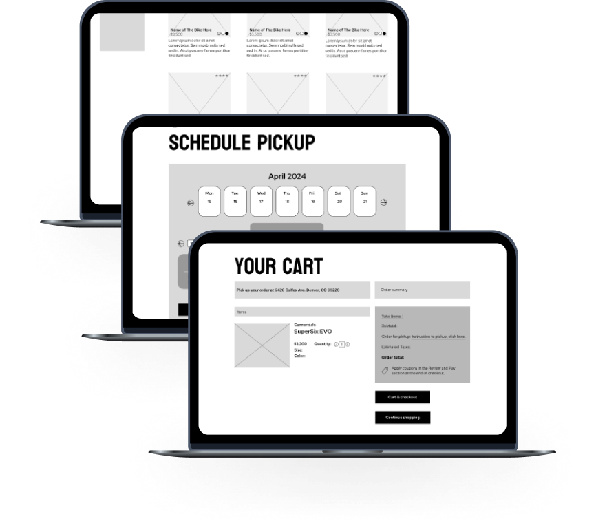
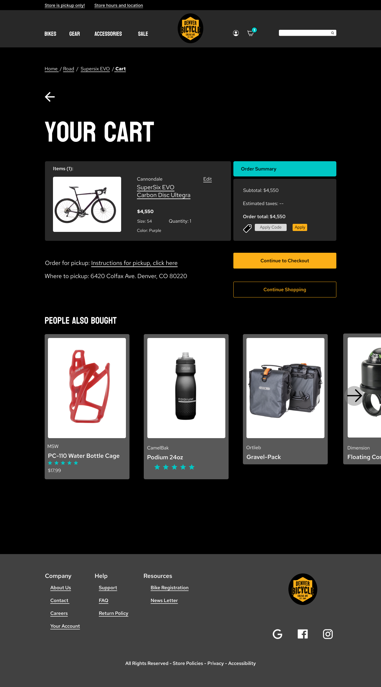
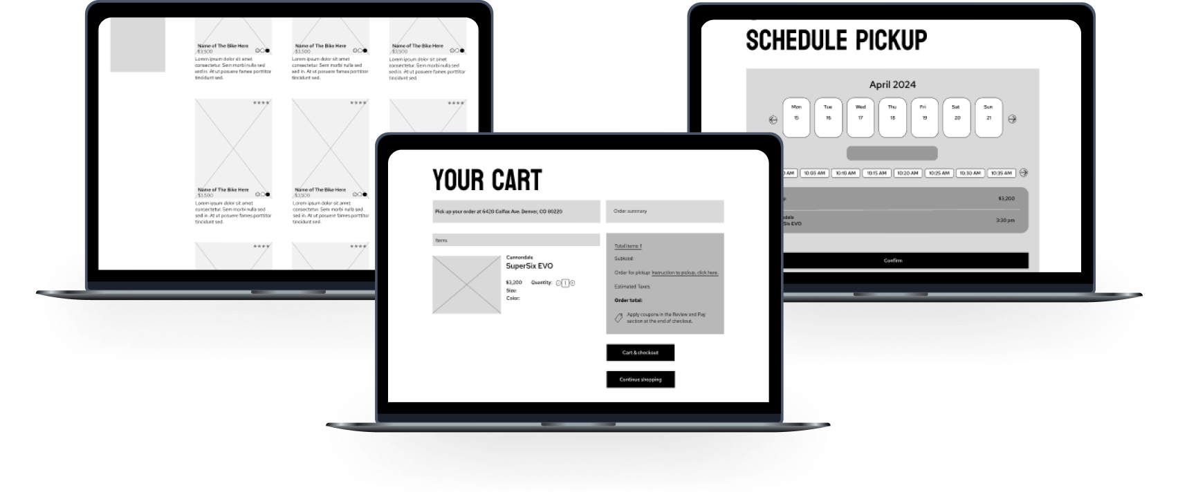
The solution was introducing an intuitive checkout process that clearly communicated the order pickup policy before and upon completion and a scheduling tool. This level of transparency from the beginning aimed to prevent user dissatisfaction.
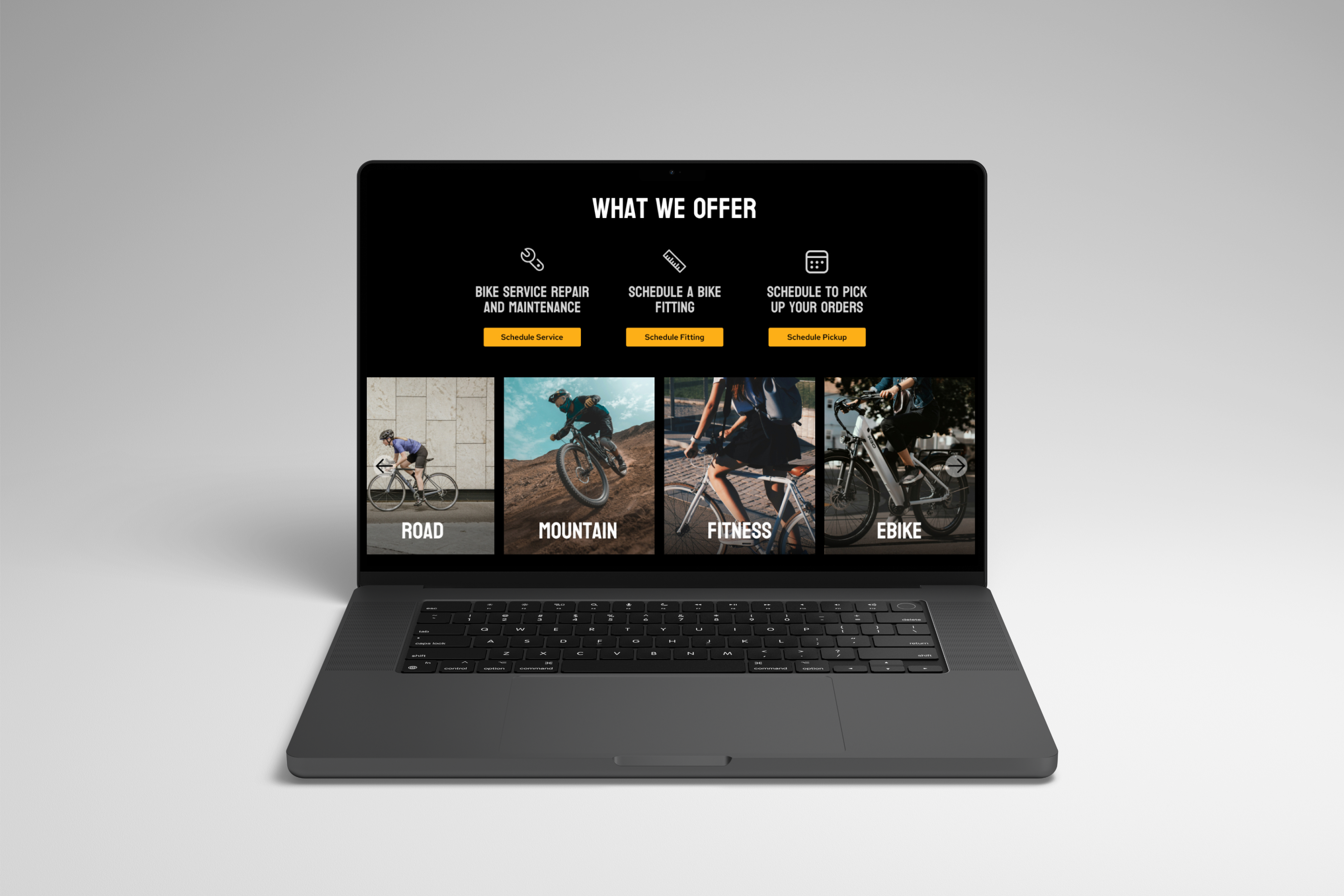
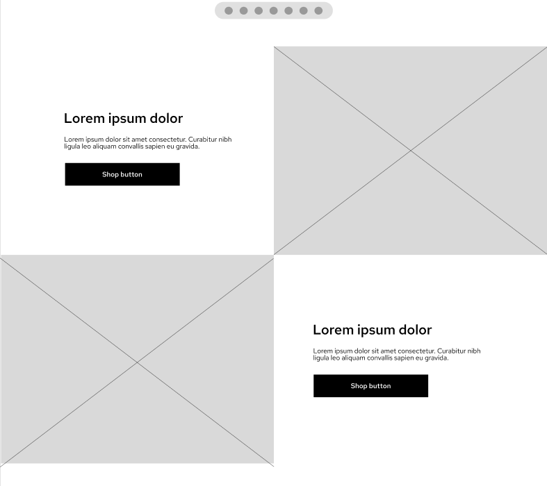
Clearly Showing users what to expect before making a purchase
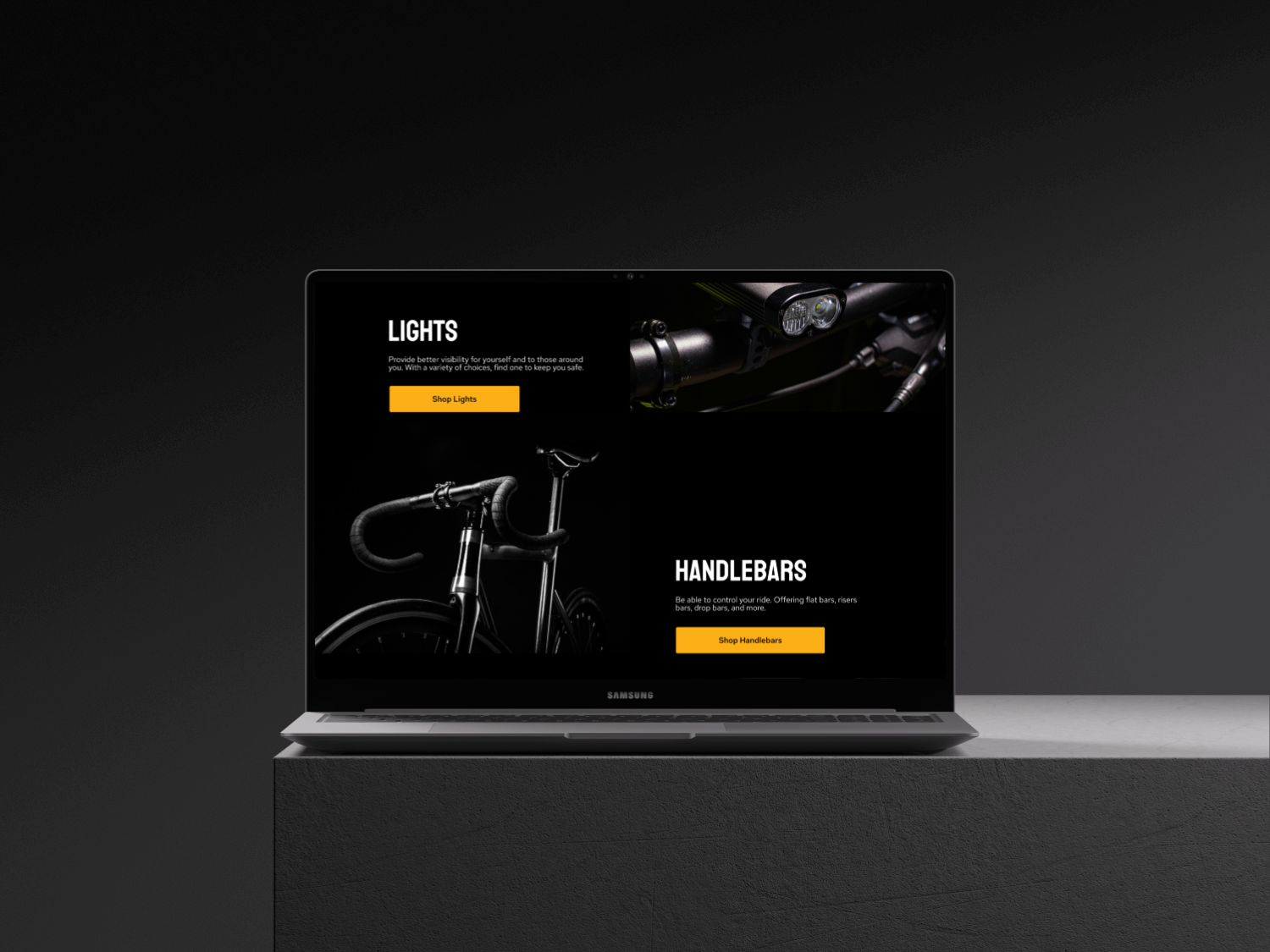
Creating clean and easy to read layout for seamless user interaction.

Usability Testing
- Conducted 3 usability tests with users who all had varied cycling skills.
- Users consisted of 2 males and one female between the ages of 28-48. All based in Denver, Colorado.
Tasks
Task 1:
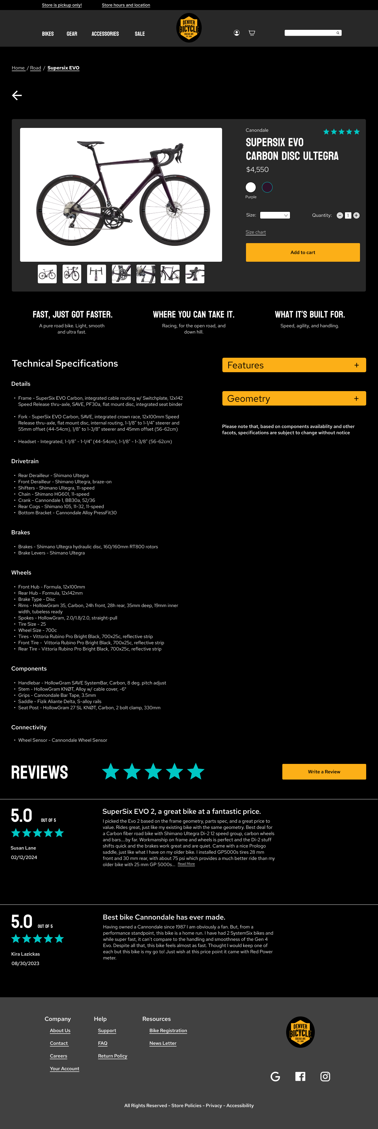
Are you able to find the Cannondale road bike called the Supersix EVO Carbon Disc Ultegra?
33%
of the users had errors finding the bike. The issue was that the users wanted to click throughout the wireframe and did not adhere to just the task itself.
Task 2:
Can you add the bike to the cart, Once you have it in the cart, select “checkout as guest.” Then please schedule a time to pick up your order for Wednesday, the 11th at 3:30 pm. Once you have selected a time, please finish checking out.
67%
of users were able to successfully complete task 2. Error was due to not having brand names listed.
UI Decisions
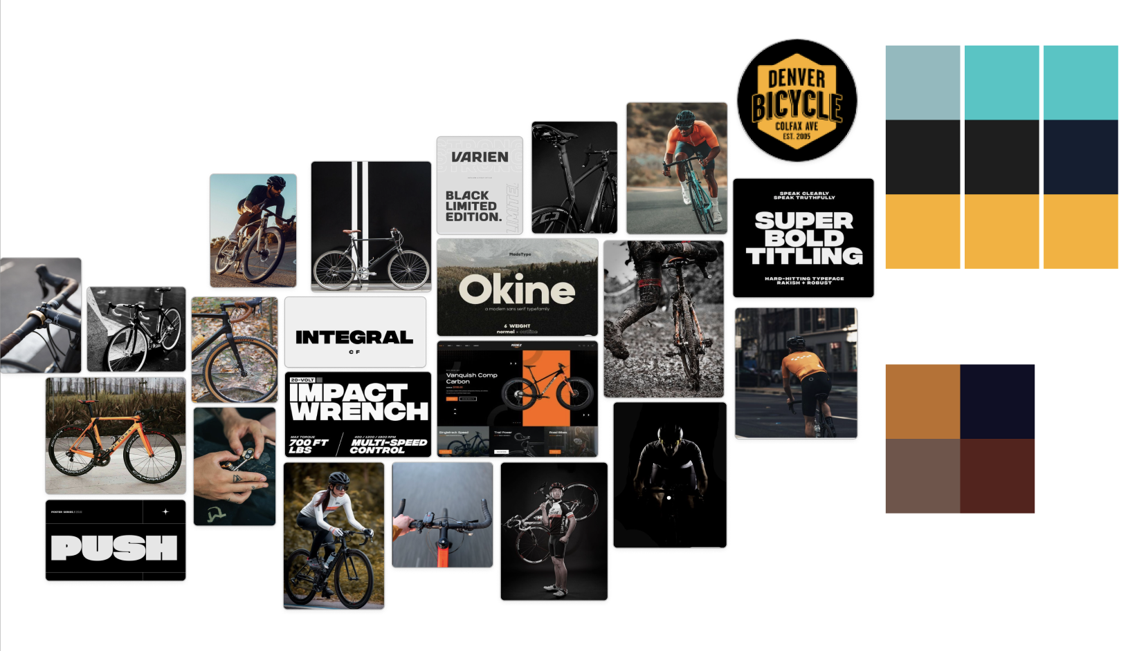
We were advised to create a mood board, find our fonts, and to cultivate a color pallet. Inspiration came from reputable bike brands such as Canonndale, Specialized, and Trek.
- The energy was aimed to be high and intense.
- Show professionalism.
- A dark-mode layout.
- High energy.
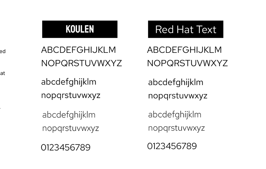
Type Face
The typefaces were picked to show high energy. To get users excited about their new/potential purchases.
Koulen was chosen due to the the energy it shows. It is also has great legibility when reading.
Red Hat Text used for clarity and visual accessibility.
Koulin was used for H1’s and H2’s and Red Hat for H3’s, 4’s, and 5’s.
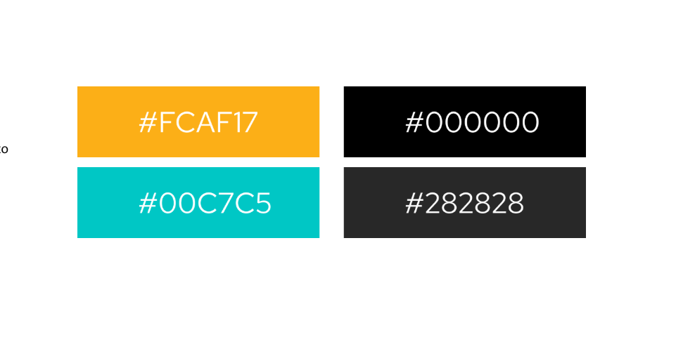
Color
For color, I chose true black, dark grey, orange, and a teal blue. I wanted to use original colors from the site. They didn’t have many colors and didn’t apply the one’s they had well on their site. I decided on using their logo colors which had orange and black. I then added the teal as a cooler color. Black ended up being the primary, orange the secondary, and teal was the tertiary.
Designs & Iterations
This redesign was able to be pushed and pushed even further. It felt as if I could see the finish line but there was one more final push to get it perfect. Iterations included:
- Placing items on product cards
- Containing elements
- Better readability
- When to show or hide information
- Hierarchy
- Spacing
High Fidelity Mobile Mockups
Next Steps
Prototyping the full wireframe.
Give the filter the ability to shrink and open. This will clean up the page for a more minimalistic feel.
Give users the ability to go from dark mode to light mode. This will allow users to view products in their preferred viewing method.
Run a heuristic evaluation on the redesign to ensure that the design is cohesive and accessible.
More to Explore
Kira
About
Resume
INDUSTRY:
User Experience
CLIENT:
Denver Bicycles
YEAR:
2024
TYPE:
Desktop Redesign

Denver Bicycles


Evan
Thompson
Occupation
Director of Retail
Location
Denver, CO
Age
24 years old
Family
Married. 2 children
“I’m either helping folks at work or juggling my kids around. I find it hard to spend a lot of time looking for what I need for my upcoming race.”
Problem Statement
Evan needs to find a specific bike for his upcoming race. But if frustrated with how disorganized the website is. Evan needs to find his bike and pick it up at a specific timeframe.
Journey Map
View on Figma

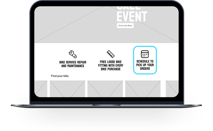
Macbook Air

Clearly Showing users what to expect before making a purchase
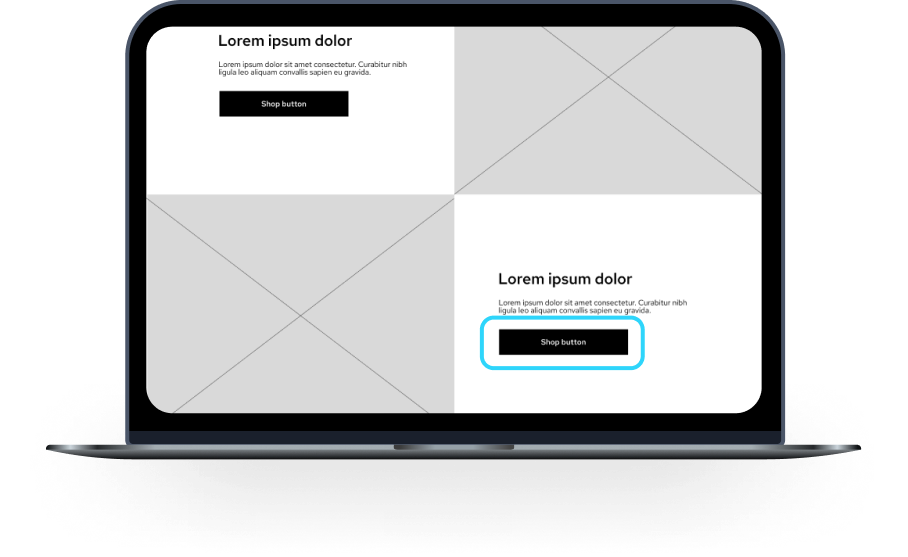
Macbook Air
Creating clean and easy to read layout for seamless user interaction.
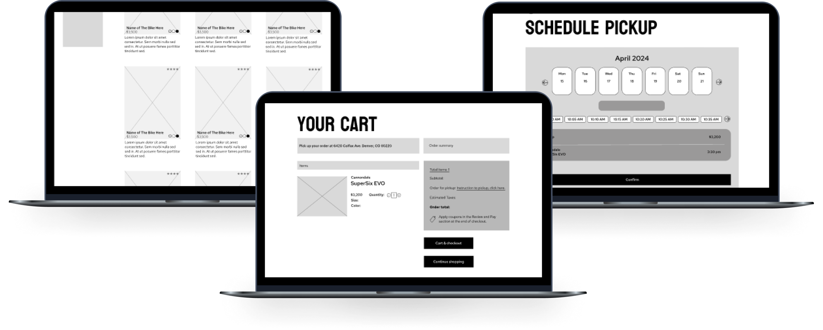
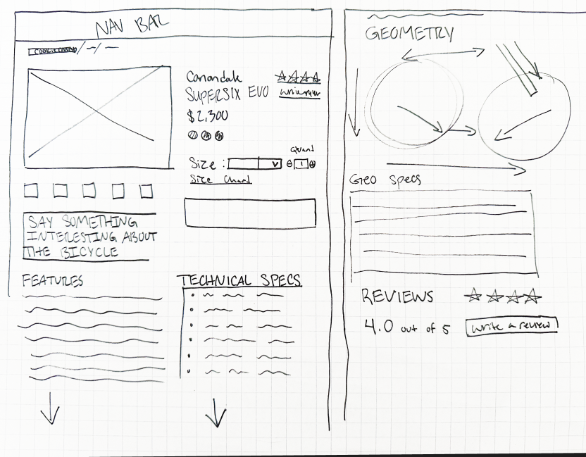
Wireframes used for usability testing.
High Fidelity Wireframes